Inside the Artist's Studio: Donna L.'s Warehouse Workspace
CoCo Artist Donna L.’s studio is located in Long Island City (LIC), a stone’s throw away from Manhattan. The city’s skyline gleams from across the water, but feels a world away from LIC’s hushed industrial landscape now populated with warehouse-cum-artist studios.
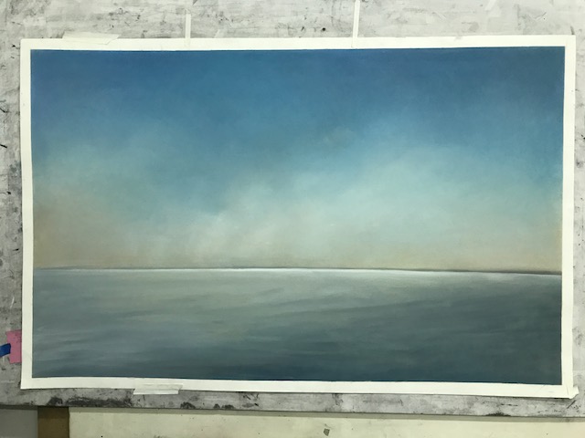
Donna’s studio is located on the third floor of one of these warehouses. She meets me at the top of the elevator and leads me to her studio, past a community library where a mix of art books, cookbooks, and philosophical manifestos perch precariously on a bookshelf. Donna’s studio is strewn with art supplies. Brushes, stacks of papers, and boxes absorb the available surfaces. In the middle of the room is a folding table covered with newsprint. The beginnings and in-betweens of projects rest on the surface. Against one wall are stacks of pastel drawings of sky-scapes, seascapes and mountain-scapes. They are breathtaking in person, and seem to glow with a lit-from-within quality. I mention this to Donna and she smiles. “Yes, my real subject is light.” She’s not kidding. Despite the studio’s lack of windows, Donna’s radiant work gives the impression of a sunlit room. There’s a stack of metal drawers against another wall and she opens them one at a time to reveal a marvelous collection of works on paper. They are much smaller than the ones lounging against the walls, here lie entire horizons collapsed into the space of a business card.
CoCo: Why do you work in such dramatically different scales?
Donna: These little worlds are so much faster to finish than some of the larger ones, I like the immediacy. It helps to get an idea out quickly, and provides some relief from the larger pieces. Of course, the large ones provide something to focus on for a long time. I have really large ones too, works that are 40 x 60. I’ve noticed that the larger works have a softness to them that isn’t present in the smaller works, it’s interesting how scale can affect something like that.
CoCo: How do the images take shape. Do you use reference photos?
Donna: Yes, but not usually just one, I combine multiple photos and sample the elements that I like. Sometimes I make it up. I’ve done enough of these now to understand how the sky could look.
CoCo: Can you tell me more about your choice of materials? Why pastels and not oil paint or graphite?
Donna: I enjoy the way the pastels allow me to work in thin layers without a heavy build-up. When I work I’m able to wipe away the layers, thin them out, blend them with my fingers and shift things around easily. I usually do high-contrast black and white pieces, but I’ve recently started working with grayer tones. It doesn’t have the same wow factor, but there’s some subtlety there. It’s delicate. I worked on a whole series of black and white seascapes that I wiped down with tissues so you can see the black pigment give way to a warm, yellow-tinged undertone. That’s something you can only get with pastels. It’s also interesting to use a material that isn’t traditionally associated with this type of work. Pastels are usually associated with flowers or still-lifes. I also enjoy working with watercolor and collage. I’m hoping to explore more of that soon. I’m inspired by some of the early 20th century collages, Kurt Schwitters and the like.”
CoCo: How do the white edges of your works stay so pristine?
Donna: I tape around the edge of where I want to image to go. This creates a clean line when I remove it and stops any powder from smudging on the white border. It’s funny in comparison to the rest of my studio, which isn’t exactly organized.
CoCo: What’s been one of your favorite commissions?
Donna: A man once commissioned a black and white seascape with a pop of red. It was my second commission with this client. I know lots of artists who wouldn’t be open to working this way, but I don’t feel like that. To me, there’s always something to learn. Of course, I had my doubts about how it would turn out. Red, as a color, is not very see-through. It’s not particularly luminous. Red has a density to it, and so much of my work is about light. It was a struggle to find a shade of red that lit up. That’s the thing with commissions, they always push you.This one was very difficult, but I ended up loving the result and it influenced the works that I made after. There’s an ad on the subway for Westworld now that looks remarkably similar, I feel like a trendsetter.
CoCo: What drew you to this topic to light and atmosphere?
Donna: This is such a lame reason, but when I was younger we had this convertable and I was always obsessed with having the top down and lying the seat all the way back and staring up as the sky. Of course this was terribly unsafe, and I probably never had my seatbelt on correctly. But I’ve always loved the sky, there’s something very spiritual about it for me.
CoCo: What commission are you working on now?
Donna: I’m about to start working on one with rainbows. I can see this sparking a whole series. As much as my works is about light, I also want them to provide a refuge for the viewer to feel at peace.


