Brushstrokes: Interview with CoCo Artist David P.
If you like to ski or mountain climb, then today's featured artist will be of special interest to you. CoCo artist David P. creates larger than life depictions of mountain ranges, while referencing Pop Art through overlaying dots in distinct and iconic colors. Take one look at David's work, and you'll want to experience these landscapes just as he does: the urge to breathe it all in before time crumbles it all away.
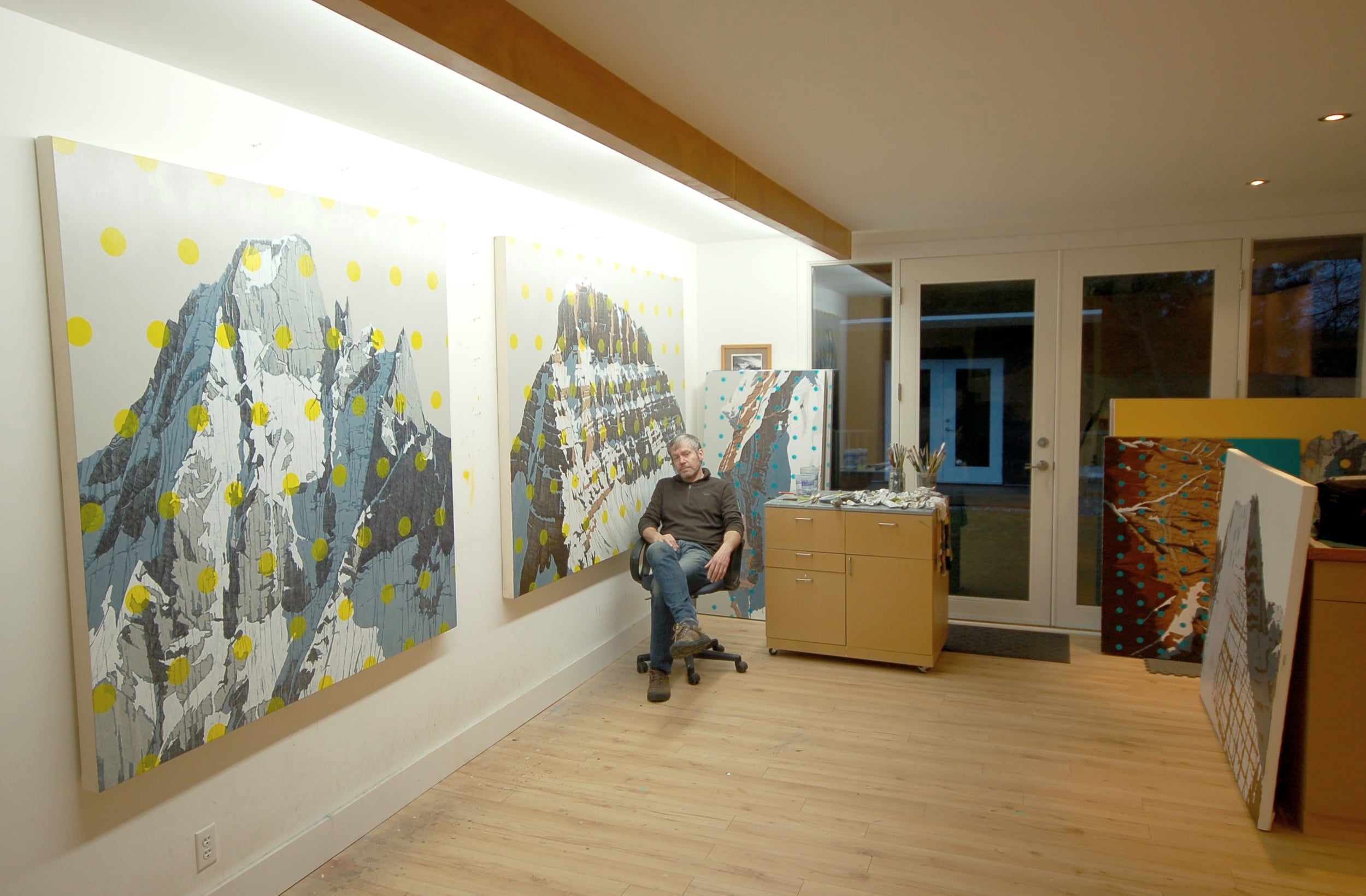
CoCo Artist David P. at his studio in Vancouver, Canada.
CoCo: What inspired you to paint mountains?
David: I have been climbing, skiing and mountain biking all of my life. I grew up in North Vancouver, a particularly unique suburb of Vancouver Canada where I now live and have my studio with a forest and river in my backyard. It is situated literally on the edge of the wilderness in the mountains, with the city across a narrow harbor.
Favorite Commission: The Grand Teton, Early Winter Sunset, 2014; oil on canvas, 40” X 100”
CoCo: What are you trying to say through your work?
David: I’ve never wanted to stop exploring in the mountains and seeing what’s on the other side. Their isolation, beauty, and grandeur humble me — I am but a speck in time and place. Your life and your matters have little consequence when you’re in the mountains: The mountain shrugs and you fall off.
Picket Range, N. Washington; oil on canvas, 34" X 48"
CoCo: What do you hope for the viewers of your art to experience?
David: I hope people will experience our fleeting life in contrast to the slow rise and fall of the mountains. To do this, I closely study the morphology of rocks, the movement of glaciers, erosion. I contemporize the the landscape in order to ask the viewer to think of time on a geological scale.
CoCo: Can you lead us through an aspect of your artistic process?
David: In many ways, I treat my paintings almost like scientific inquiries. Gridding, mapping — contemporary filters for how we look at landscape now — with Google Maps and satellites through technology. And that’s partly what I’m getting at with the use of these very bold colors that are almost from the digital world.
Mt Robson, West Face; oil on canvas, 54" X 75"
CoCo: Tell us about the dots.
David: I started adding dots about four years ago, after having used grid-like patterns. It seemed like a natural evolution for me. I was looking for a way to add intense color and to reference mapping. The dots are so completely opposite from the natural monochromatic palette that I’m using: there’s an incredible contrast. Your eye oscillates between the foreground and the background, and it creates an interesting effect. People end up focusing even more on the mountains.
To see more of David's work and to inquire about commissioning from David, please email us at info@cocogallery.net or fill out a form online.


